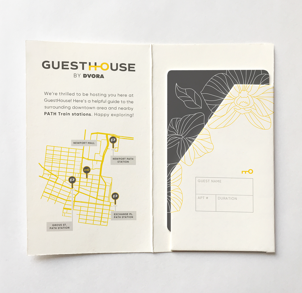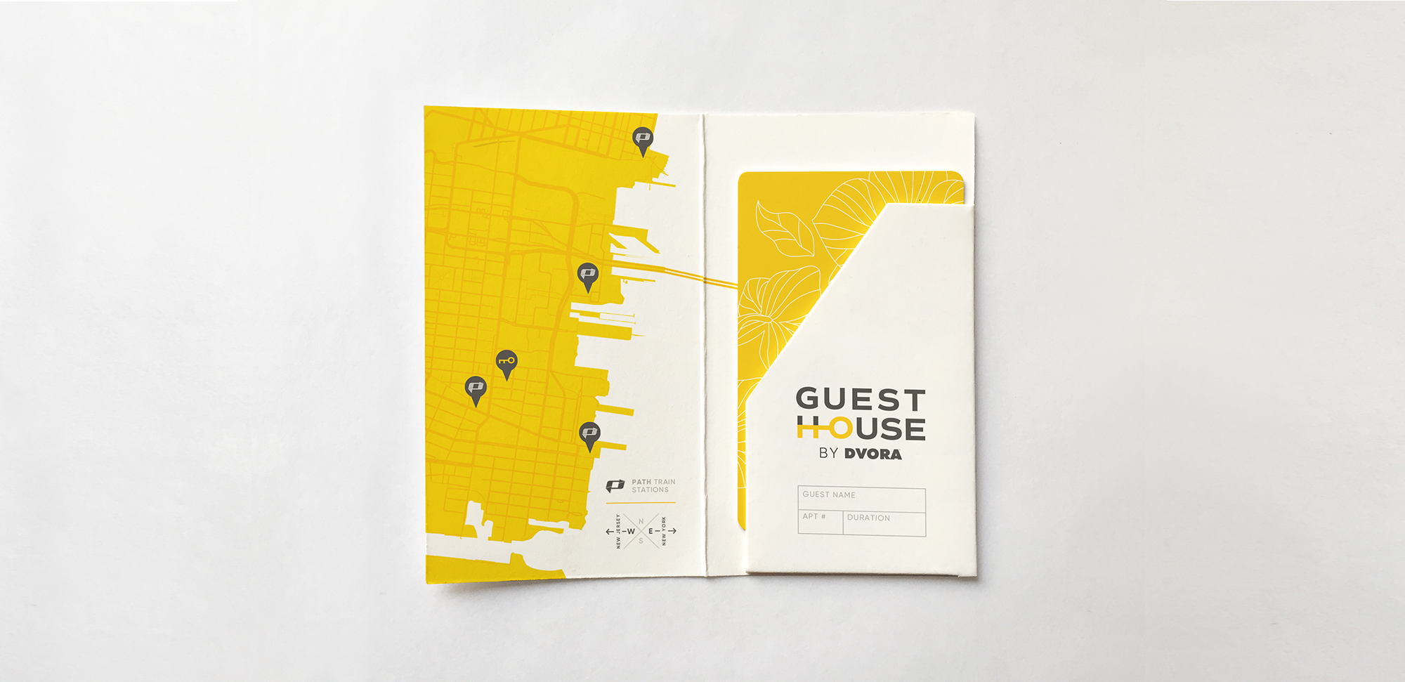
Newcomer real estate company DVORA has grown well in sync with Jersey City’s recent property boom. But their goals transcend rental and sales. DVORA is crafting an ecosystem that offers tons of crazy good perks in its co-working and living spaces.
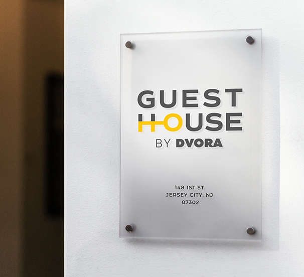
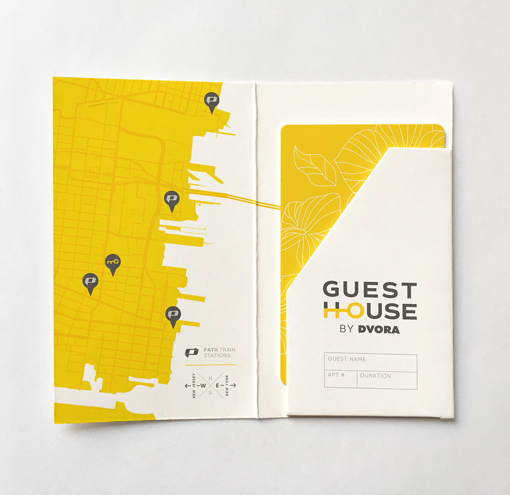
Guesthouse by DVORA started as a resident amenity. Now open to vacationers, seasonal workers, and other temporary visitors, it’s a new product: a flexible rental with hotel-like services.
![]()
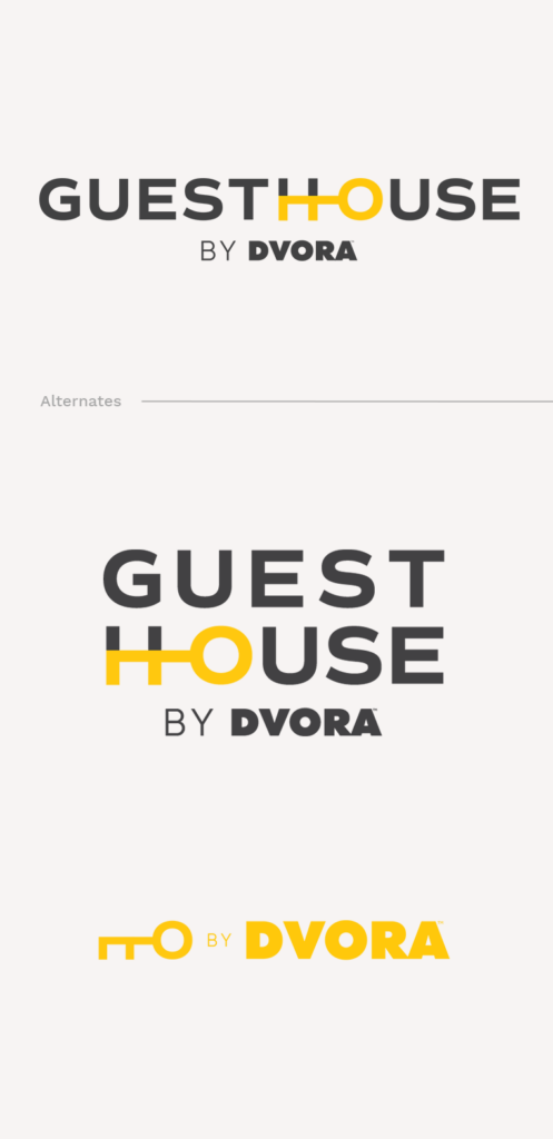
ROLE Design Lead | Logo Design | Branding
TEAM Danielle Ma, Kendra Stoll
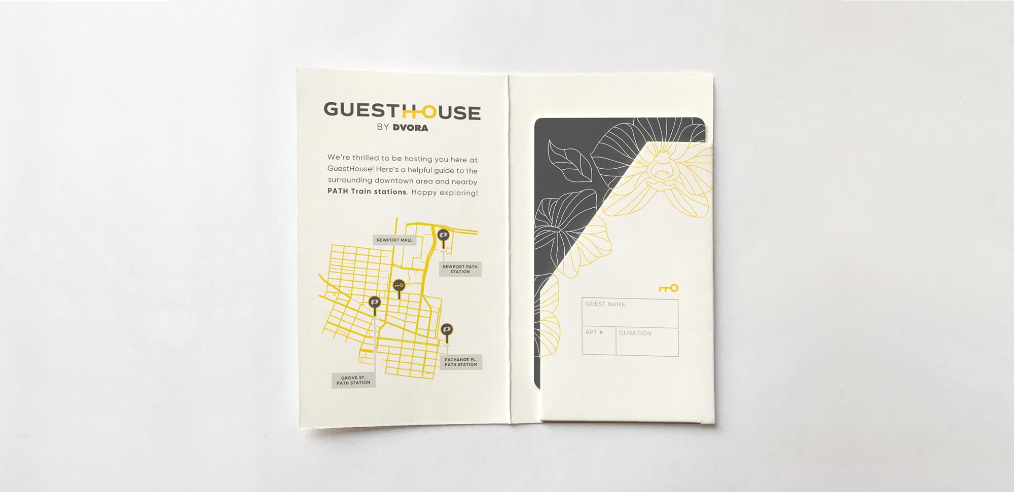
Newcomer real estate company DVORA has grown well in sync with Jersey City’s recent property boom. But their goals transcend rental and sales. DVORA is crafting an ecosystem that offers tons of crazy good perks in its co-working and living spaces.
Guesthouse by DVORA started as a resident amenity. Now open to vacationers, seasonal workers, and temporary visitors, it’s a new product. Flexible rentals. Hotel-like services.
![]()
ROLE Design Lead | Logo Design | Branding