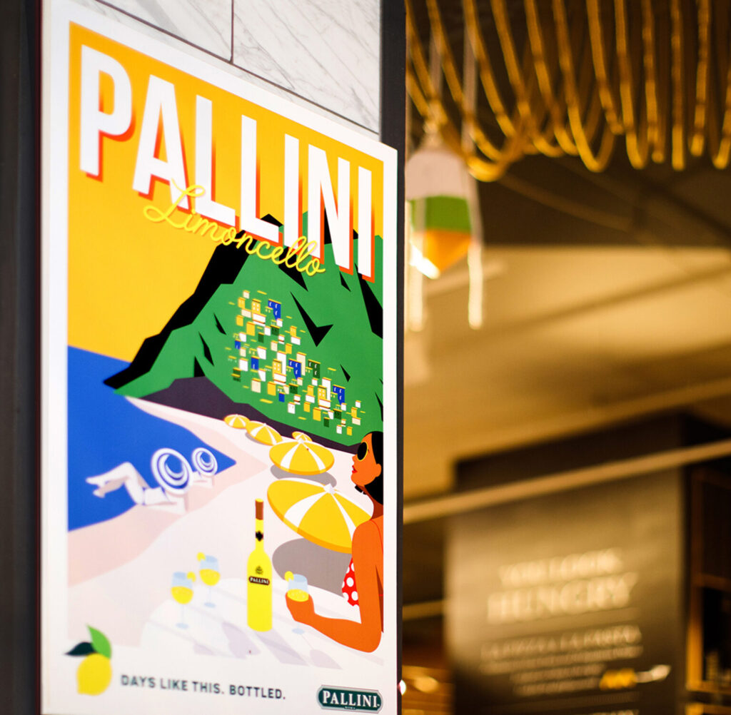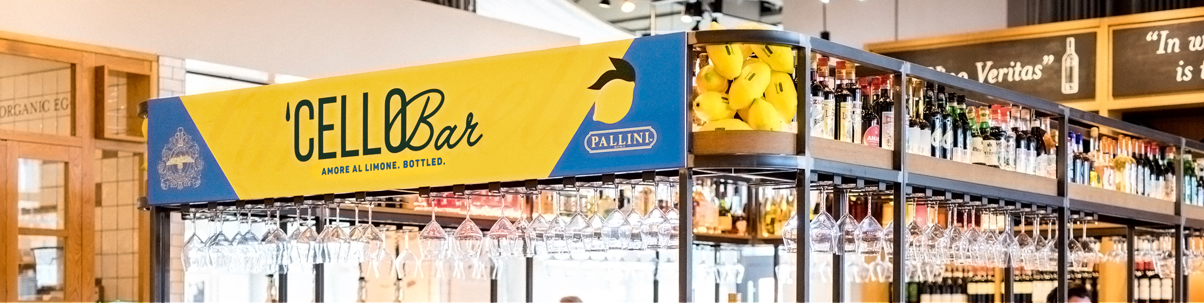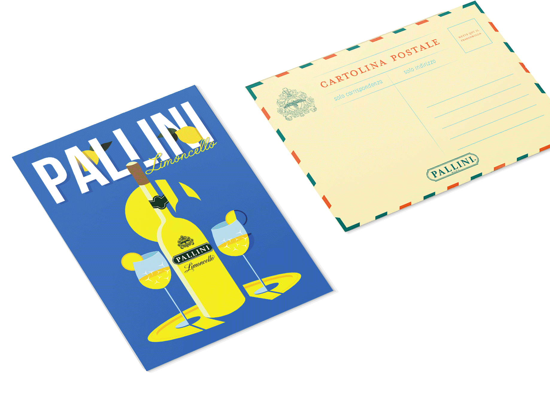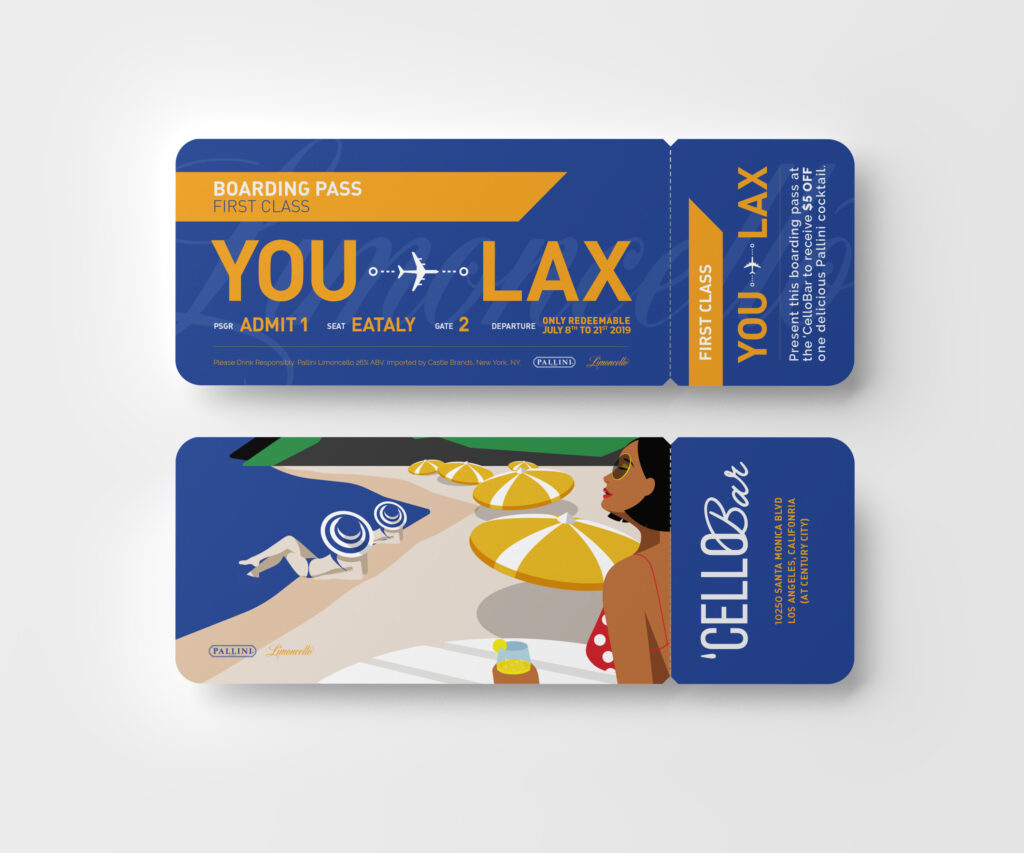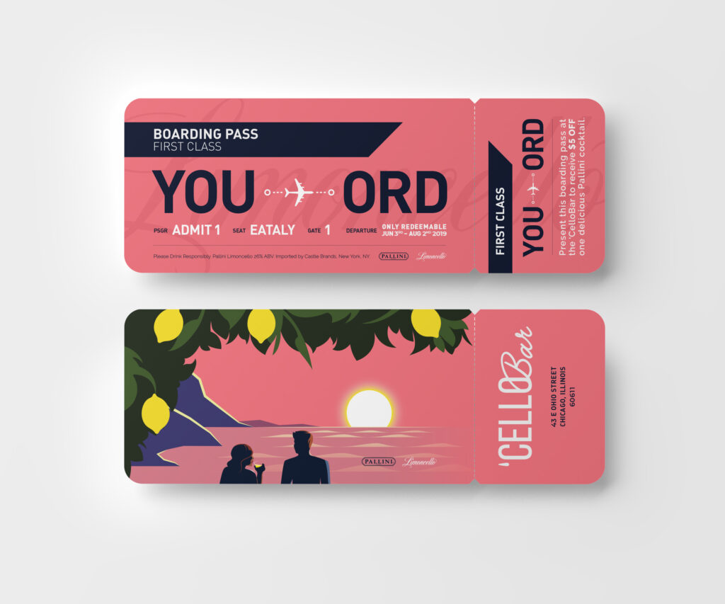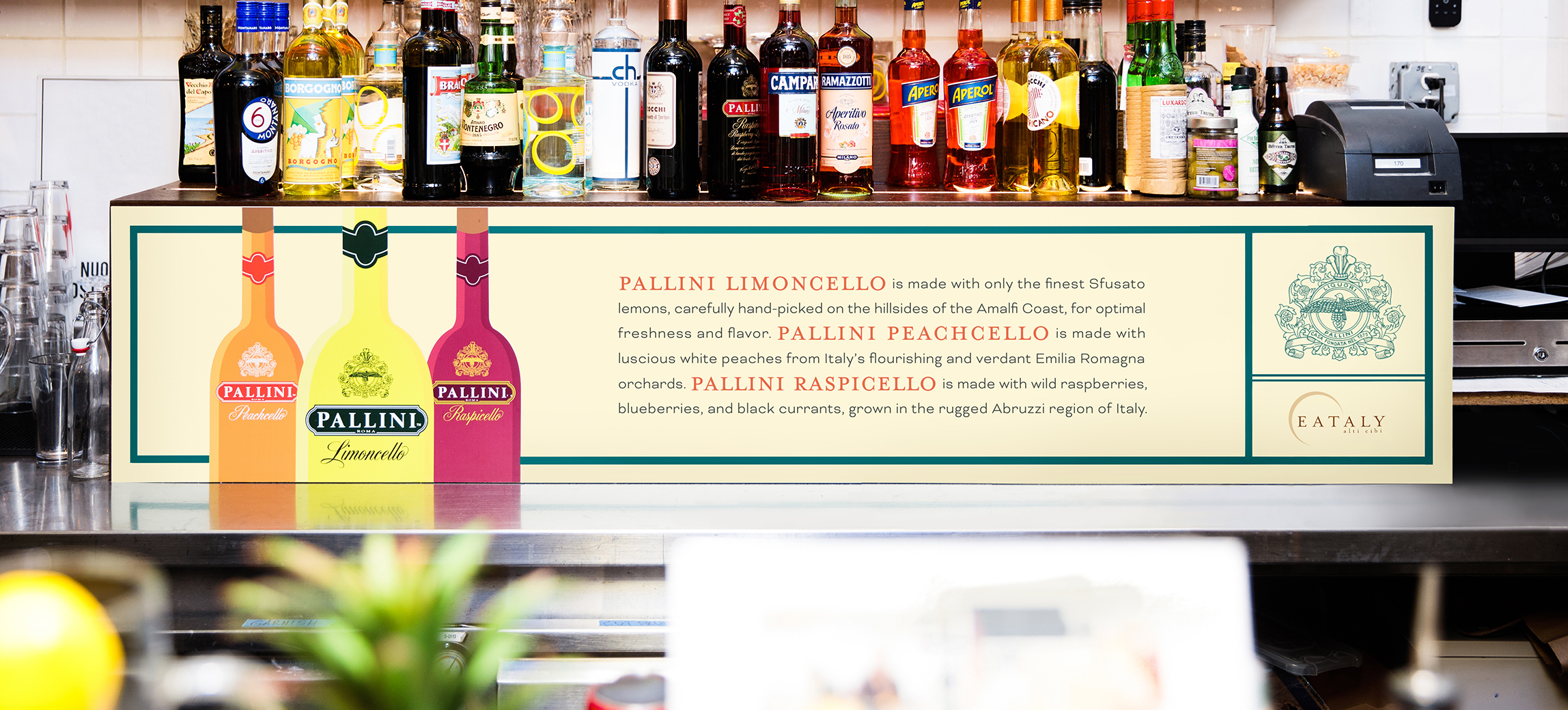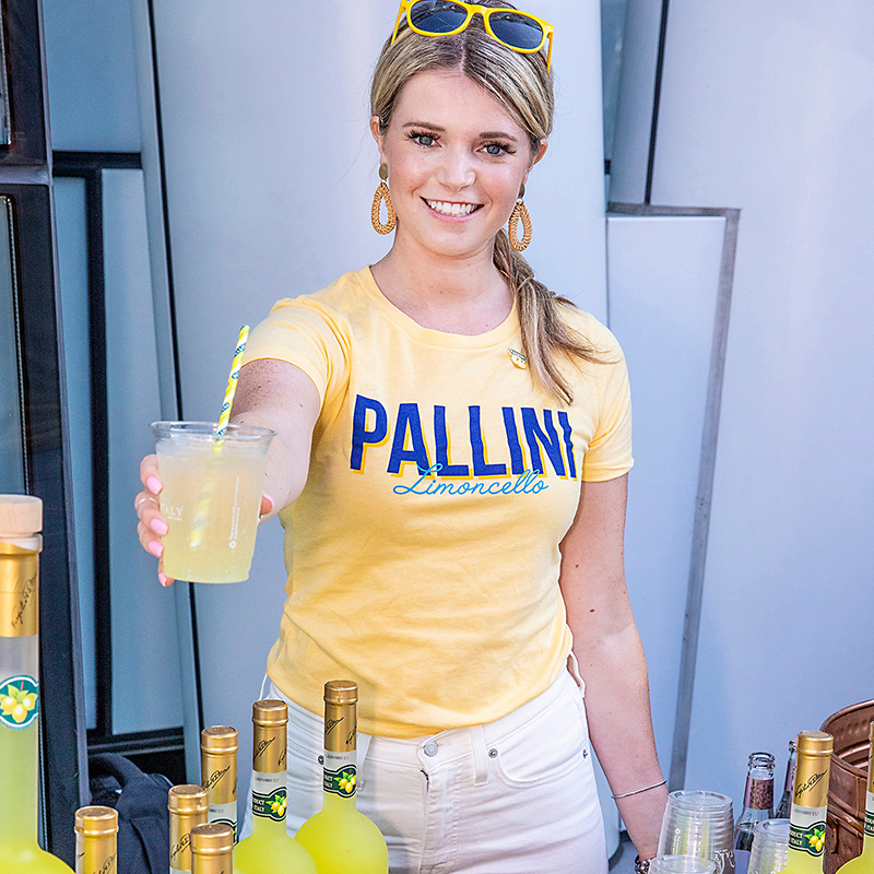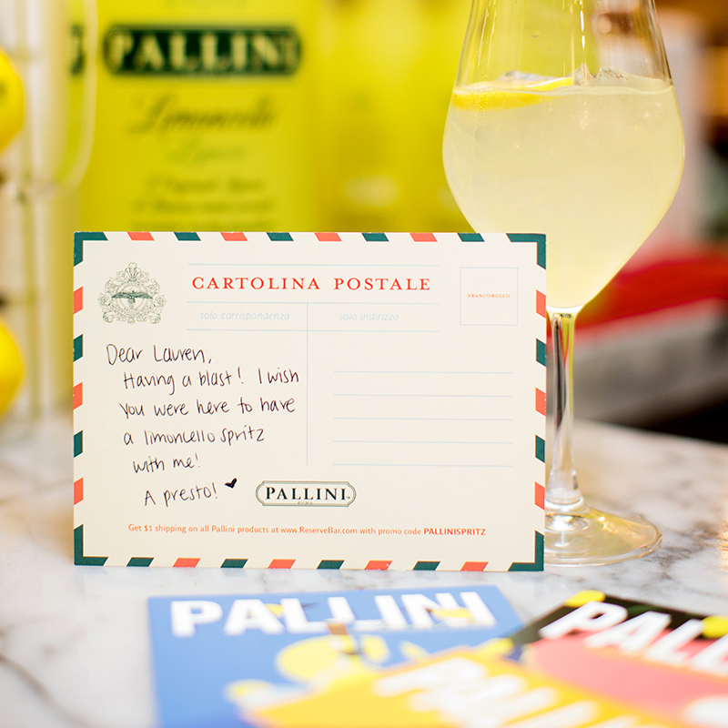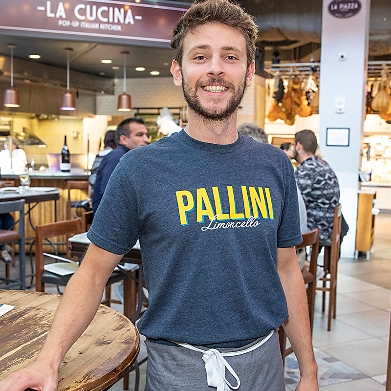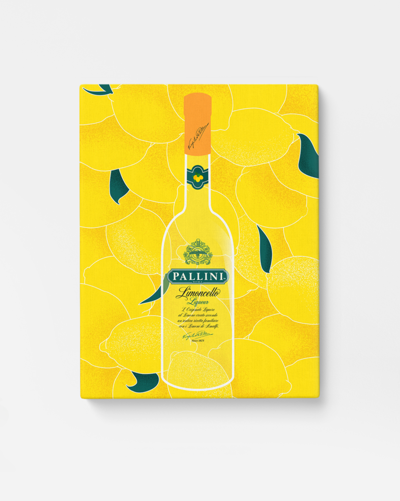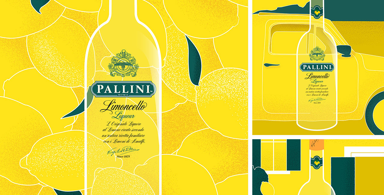
Pallini Limoncello is a product that feels pretty fantastical. And it’s true; their lemon orchards are perched high on Italy’s dreamy coastline. And yet, the brand’s go-to visuals tend to lean fairly literal.
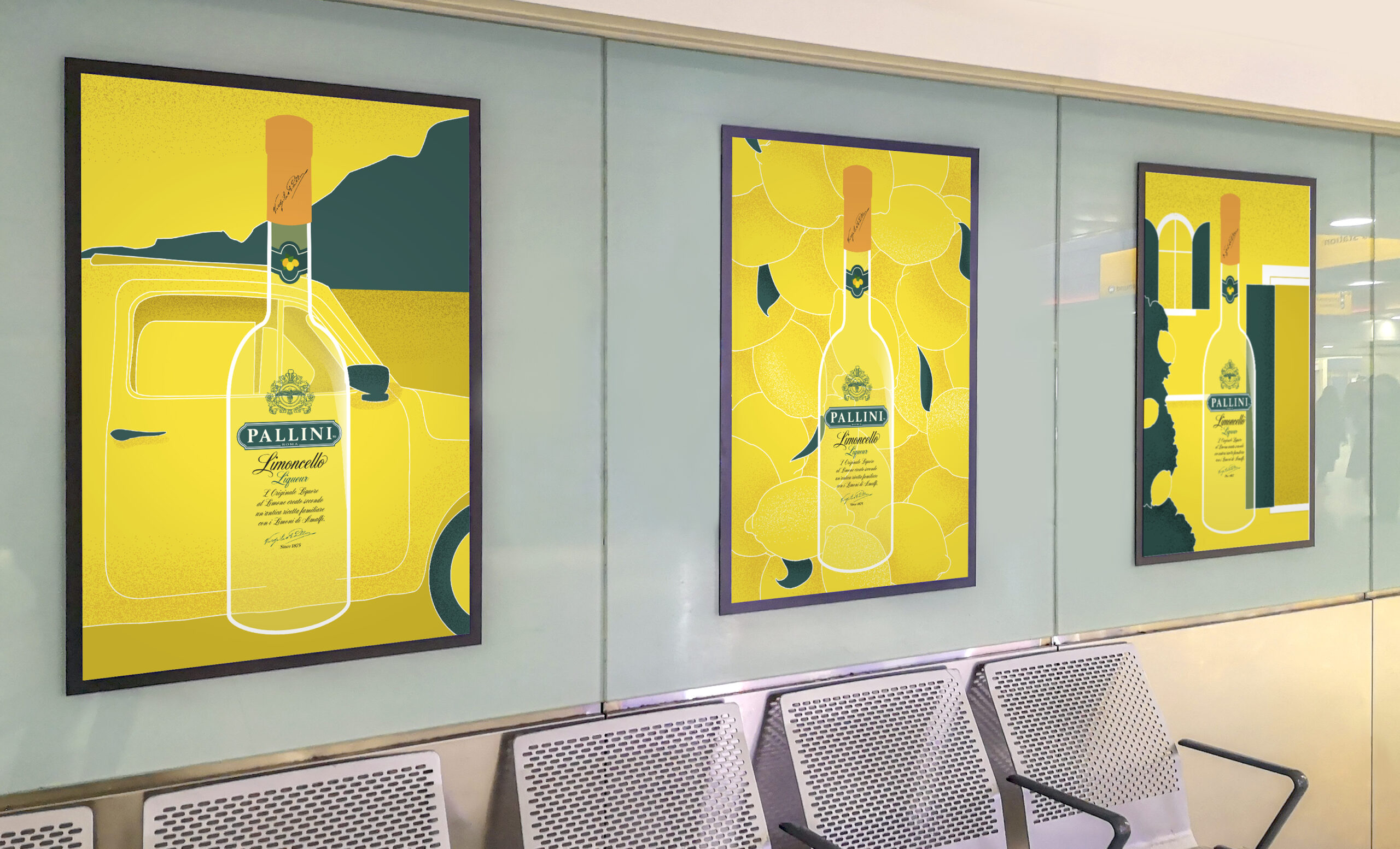
Our team was approached to develop a new look for a very new kind of setting. Over four months, Pallini would host immersive pop-up events across five U.S. Eataly markets.
![]()
ROLE Design Co-Lead | Experiential Design | Illustration
TEAM Brandon James, Emma Radmilovic
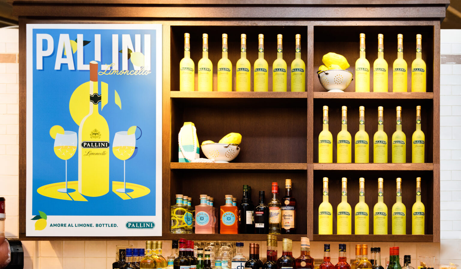
Pallini Limoncello is a product that feels pretty fantastical. And it’s true; their lemon orchards are perched high on Italy’s dreamy coastline. And yet, the brand’s go-to visuals tend to lean fairly literal.
Our team was approached to develop a new look for a very new kind of setting. Over four months, Pallini would host immersive pop-up events across five U.S. Eataly markets.
![]()
ROLE Design Co-Lead | Experiential Design | Illustration
TEAM Brandon James, Emma Radmilovic